
Times App Downloaded
Positive Reviews Earned
App Engagement Increased
Muny Card is a website for an app of the same name. Designed to ease the burden of parents and make children more responsible, Muny Card works on a reward system. Parents create a job card and set rewards for their children, usually a gift from Amazon. Upon completing the tasks properly, children can claim and earn the prizes, instead of simply asking.
How do you design a website for an app whose target audience is parents and children alike? The owners of Muny Card found it challenging to find the answer to this question. Too childish, and the website would’ve irked the parents. Too serious, and the children would’ve found it boring. Committing even a small mistake could’ve ruined all their hard work – that too when their business was just finding its footing.
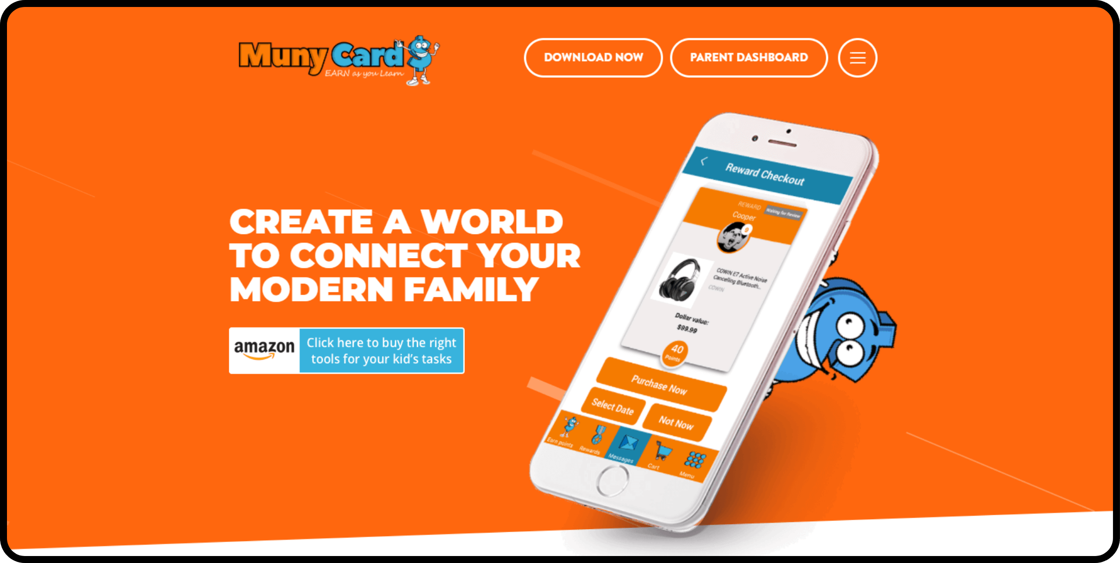
After hearing about Muny Card’s idea, we were quite impressed. It was something we hadn’t heard about before, which made the website designing process a bit challenging. But we loved every second of working on the project. The first thing we did was choose a striking orange color for the home page, so that it could attract both parents and children. Then, we used large typography to increase the readability. Finally, we created cartoon-like characters so everyone could relate to them.

The Muny Card website was a massive hit among parents and children. And yes, while they couldn’t stop talking about the app itself, a lot of people were impressed by the website as well. They talked about how easy it was to understand everything, including the app’s functionality. And not just the visitors, Muny Card’s founders also had positive things to say about our designers. They especially liked how we had made the website informative yet fun and attractive at the same time. All in all, it was a memorable experience for all the parties involved, where everyone learned a lot of new and interesting things.
Improved Search Rankings
Better Engagement
Reduced Bounce Rate